I’m a long time fan of the work of Sydney Design Studio Arent & Pyke, I love their clean aesthetic, eye for detail and their use of colour.
Barcom Terrace project is a sympathetic modernization of an 1800’s boarding house all of the images are gorgeous but the 3 that catch my eye are below…
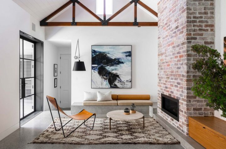
The unexpected use of concrete to create bench seating that then cleverly flows into the fire hearth grounds the room, the squab and cushion combination on the bench seat is again thoughtful. Default decision (as discussed on my previous blog) would be to have the squab full length with a multitude of cushions … I love the thoughtful detail of the short squab and the combination of cushion shapes the over-sized wall mounted lamp adds an intimacy to the space.

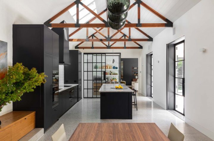
The kitchen sits majestically at the other end of this open-plan space, the steel framed joinery housing the Scullery not only visually separates the space but entices you into a space that is traditionally hidden

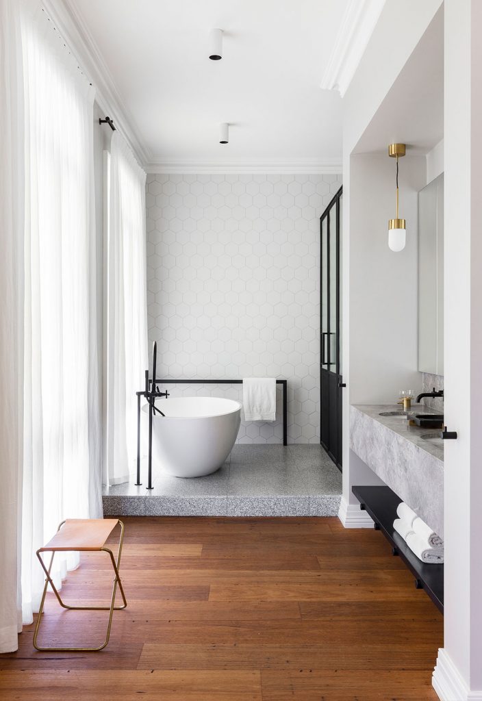
The industrial mix of the concrete plinth and black fittings with elegant wispy white fabric and marble ……

Superbly Photographed by Tom Ferguson
