Tag: architectural design

new build designed to capture sweeping views

  • 3 November 2022

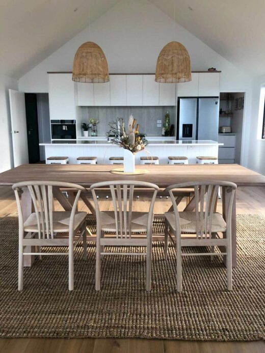
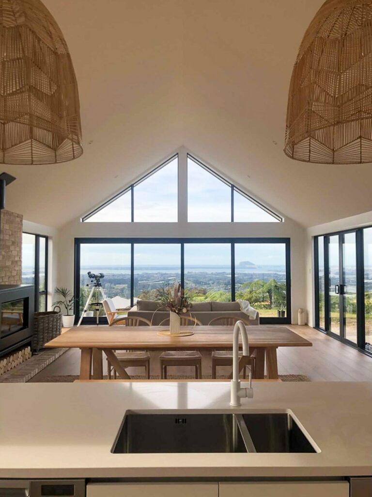
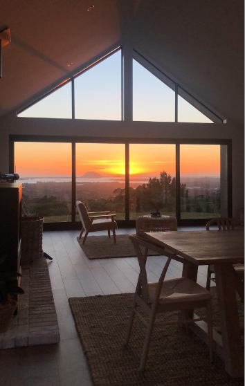
Perched high in the hills above Tauranga the interior for this recently completed home was simply a back drop to the majestic view.

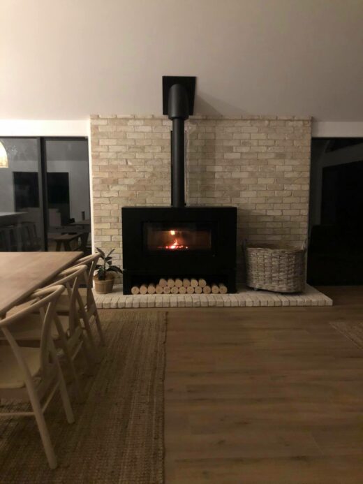
Raked ceilings draw you towards the horizon, crisp Dulux Okarito, Dusty Oak timber flooring, and San Selmo reclaimed Limewash brick … a soft restful colour palette that sooths the soul and encourages you to stop a while.


Oast houses

  • 29 May 2020

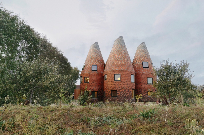
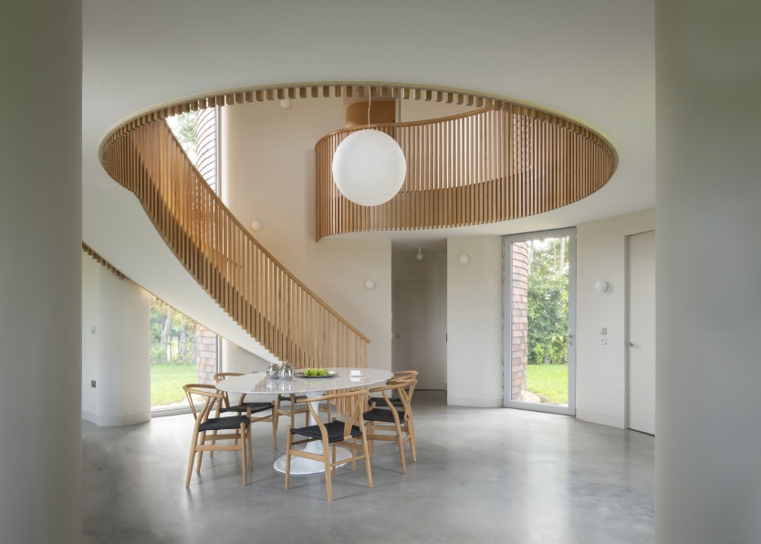
Comprised of a series of 5 tile clad towers this family home by London based ACME Architects is quite magical. Set in rural Kent the concept was inspired by 18th-century Oast Houses – buildings used for drying beer brewing hops, the construction and detailing are mindblowing.

A central triple-height space connects the 4 outer towers and serves as the entrance and family hub.

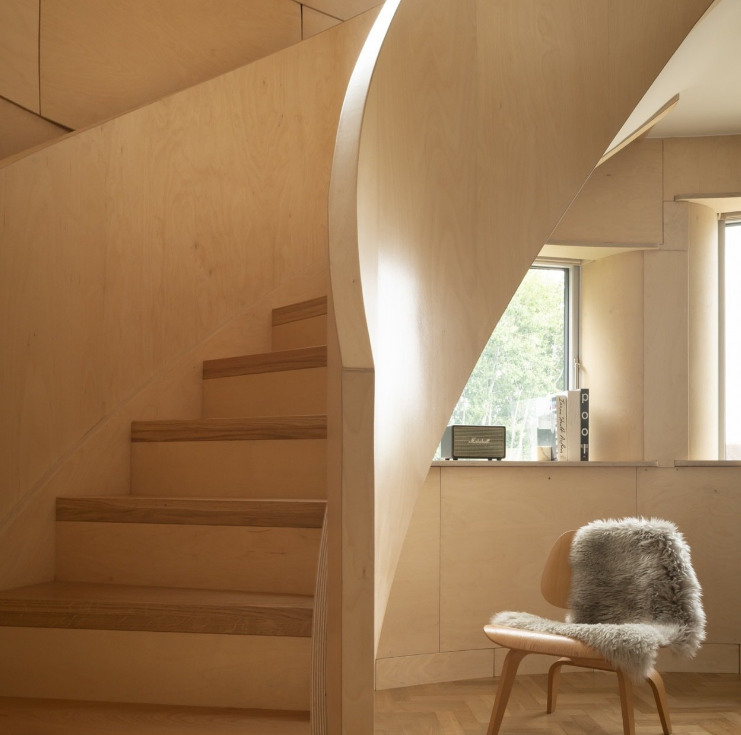
Plywood curved stairwells access Bedrooms on the upper floors

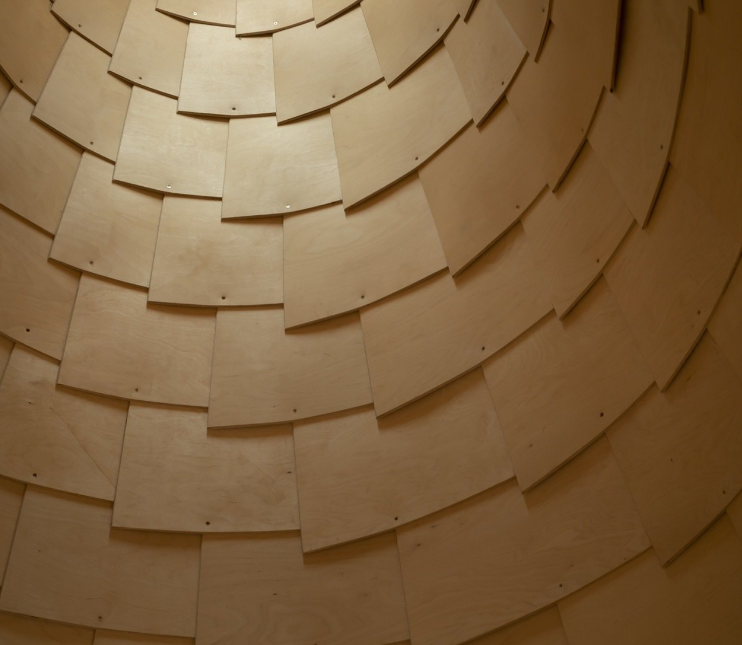
Plywood shingle ceilings echo the exterior cladding

Discover more about the project here at Dwell

Incredible images by Jim Stephenson.

Templeton Architecture

  • 7 November 2018

Take a browse through the project gallery of Melbourne based Templeton Architecture and you will see refined sophistication. Their bio describes an ethos of focusing on light, colour and proportion whilst respecting the Architectural history of each project.

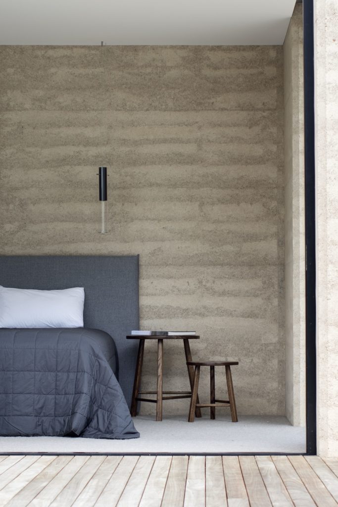
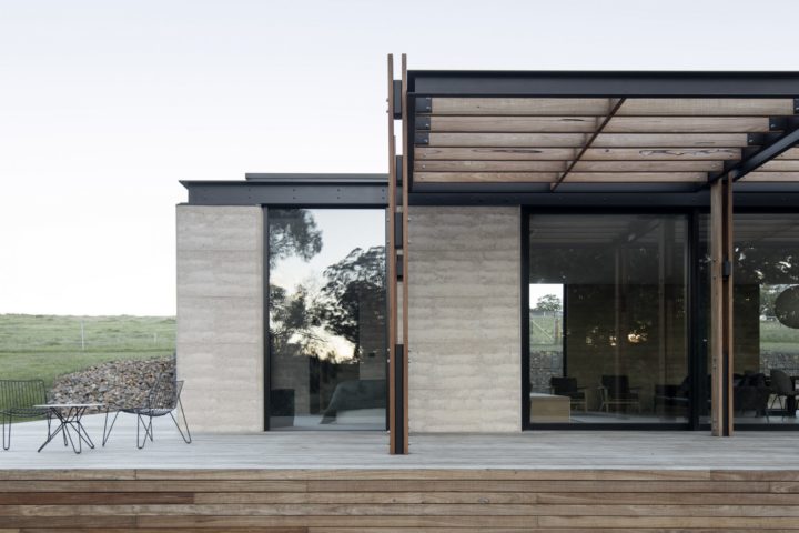
The Matilda project is a weekend getaway built on the clients childhood land Northeast of Victoria. The layered rawness of the Rammed Earth construction is breathtaking, it appears to hold history.  While the product was chosen for its thermal properties for me the solid timeless beauty of the earth surpasses any technical advantage!


Aptly described by Templeton Architecture as “The honest warmth of the material, and the depth of its construction, grounded the project into the natural contours of the land”

Templeton’s  homage to history can clearly been seen here in the Delatite Station  project as well

Beautifully elegant!


Shipping Container living

  • 8 October 2018

It’s always a privilege to listen to International Industry Experts, while it can make you feel like a pretty small fish in the big sea of the Design World, at the same time its incredibly inspiring and motivating to learn first hand about the jaw dropping projects that are going on around the world.

Recently Tauranga was fortunate enough to host  Kai-Uwe Bergmann,  a partner at Bjarke Ingles Group BIG  Kai-Uwe heads up the business development arm of the architectural practice that operates in over 20 countries around the world. The presentation covered a range of recent BIG projects, from a tiny cabin in the forest to underground gymnasiums, LEGO and GOOGLE head quarters, a new form of public transport in Dubai – non friction transport tubes and the ongoing investigation into creating living pods for Mars!! What!!

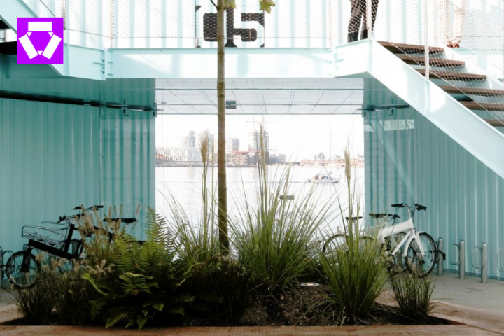
The Urban Rigger project was one that really resonated with me. Don’t get me wrong my mind was blown with all the projects but the Urban Rigger seemed to have a local Tauranga sense of scale.

The idea was a solution to a lack of student accommodation in Copenhagen.

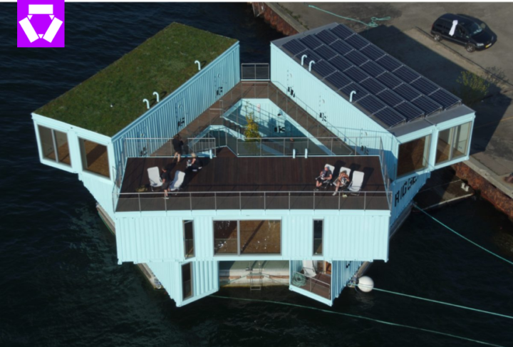
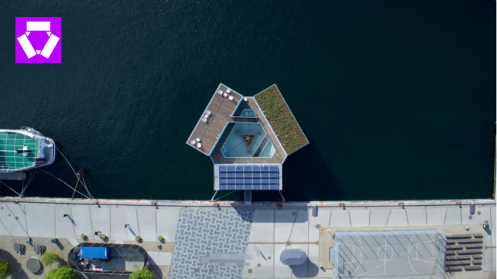
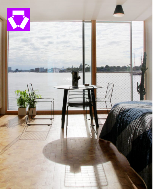
9 shipping containers were stacked in a circle creating 12 studio spaces with a central communal space and garden.  Floating on pontoons the containers were designed to be buoyant, once constructed they are moved to the harbor in the heart of the city.

Simple right? The pods were designed to connect together forming communities … with million dollar views!

These floating studio apartments were made even more appealing with the inherent paired back sophisticated Danish style.


Bosjes Chapel – an astonishing building

  • 13 March 2017

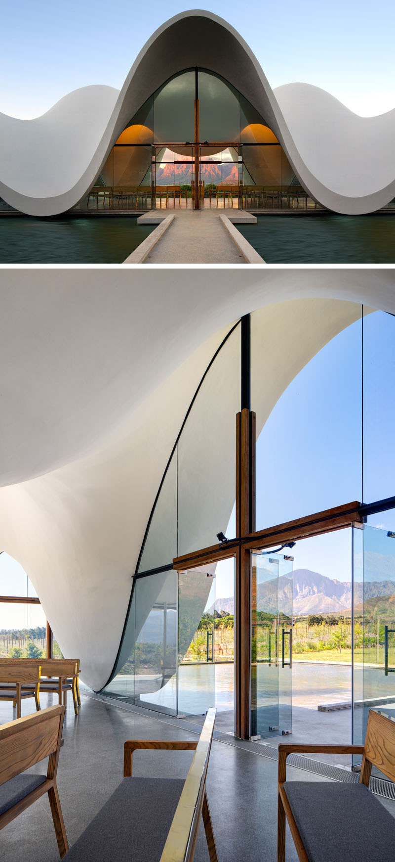
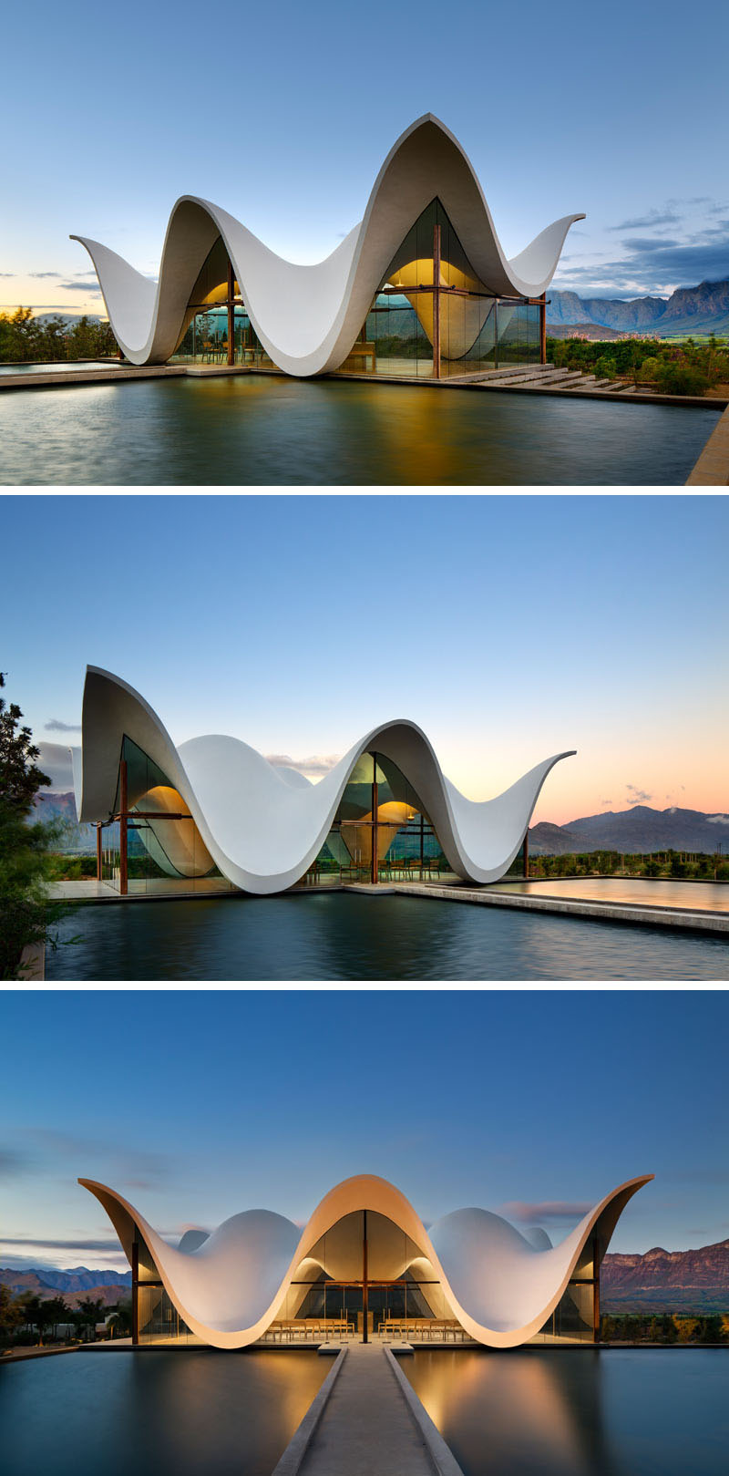
Located in South Africa’s Western Cape Bosjes Chapel is nothing short of remarkable.  The stunning organic form hovers delicately and weightlessly above an equally majestic landscape.

The crisp white concrete shell appears to be held up by nothing but glass …. how is this possible!!? The roof line swoops and soars and at points dips to almost touch the surface of the refection pool. A cross shaped window frame represents the traditional crucifix, a golden pulpit positioned in front of the window sets the scene  for contemplation.

A collaboration between UK based Steyn Studio and South Africa’s TV3 Architects. First seen on Contemporist

Elegant Country house renovated to its inspirational former glory

  • 20 July 2015

I know my work has been completed on a project when it’s time to put a call out to Amanda – my trusted photographer. It’s exciting and kind of sad in a way too as it can be a long process getting to this point. On a large complex project it’s not unusual for many months to pass working alongside clients getting to know the in’s and out’s of the  family’s life, visualizing each part of the home always with the ultimate vision in mind.

The images below are testament to this very process. I had the privilege to began work on this project 2 years ago – no that’s not a typo it really did take 2 years to ensure we left no stone  unturned.  When we began renovating, the  home was terribly neglected it was shocking to see a magnificent home so ruined by weather, fortunately the beautiful bones where in tact although in serious need of TLC!!

Bridge beams were originally white washed, Jarrah flooring water damaged, structural features were hidden, some rooms had never been completed and that was just the tip of the iceberg!

My brief was to create an elegant but comfortable country home – take a look at the results
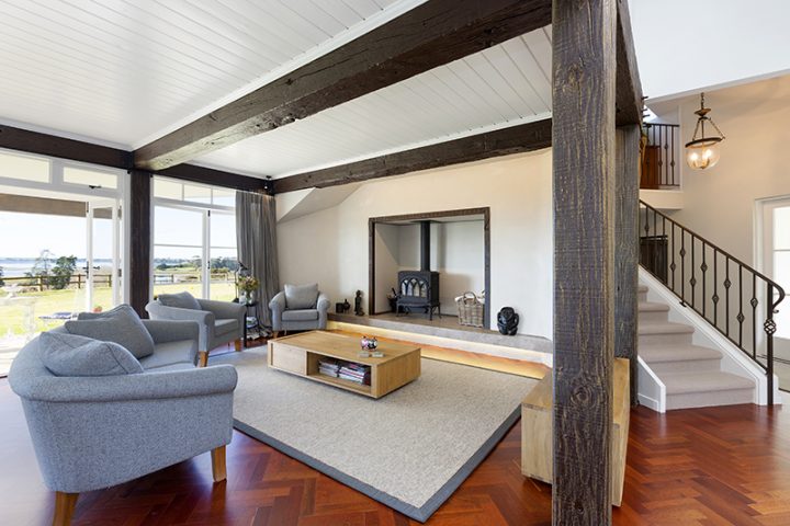
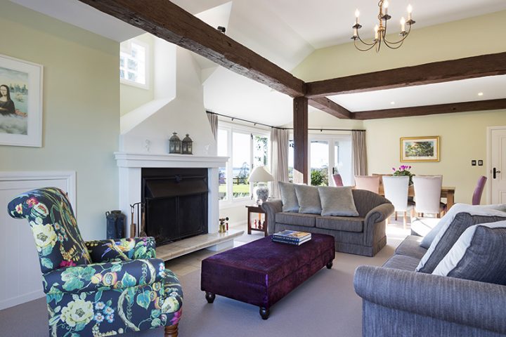
The clients had quality furniture that was also worth renovating, couches were re upholstered, family pieces were unearthed from storage and reinvented, notably the elegant arm chair in JD Madagascar Paradise. Bespoke pieces were locally sourced, the Ottoman in Harlequin Purple Snakeskin and Button Backed dining chairs in matching colored pairs.
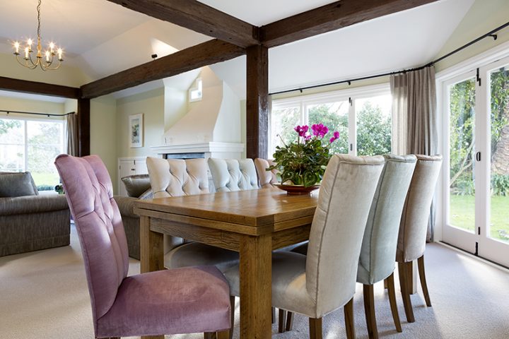
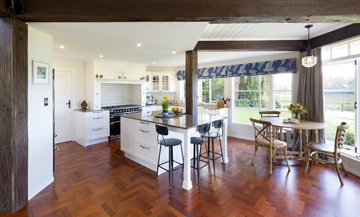
We altered the layout of the kitchen to become open plan incorporating the bridge beam into the Stone Island bench top.

Bathrooms were elegantly restyled to fit seamlessly with the essence of the grand country home.
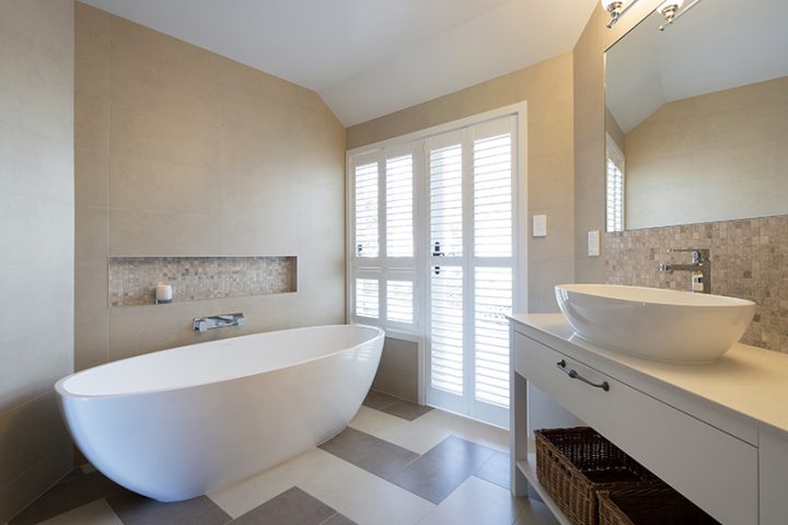
A combination of wonderful clients with open minds, a team of brilliant local tradesmen made the project an absolute pleasure ….. A good job well done I think!
Elegant Kitchen

  • 12 January 2015

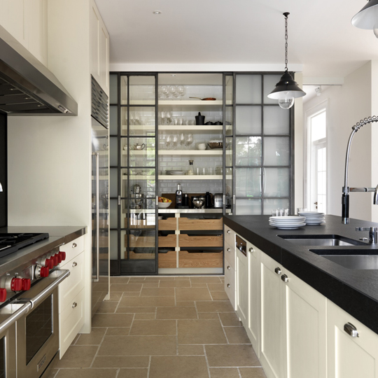
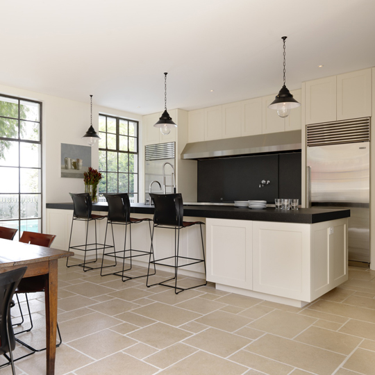
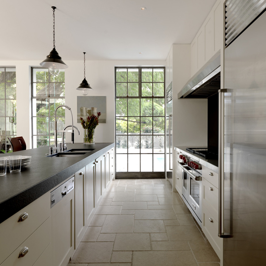
It’s the tiny details that make this elegant kitchen by Decus Interiors work so well – details applied to ordinary items that every modern kitchen has.

To me the stand out detail is the Scullery, a ‘must have’ in most modern homes the scullery is a space that is typically shut away behind doors – strictly utilitarian, the simple addition of beautiful glazed doors, timber drawer fronts, full height tiling has been transformed utilitarian into spectacular.

Flagstone floor tiles, panelled cabinetry, industrial element of the Stainless Steel all elegantly cloaked in a soft neutral colour palette.

Timeless!

Decus Interiors, Design Studio based in NSW Australia.

Black and marble kitchen

  • 14 October 2014

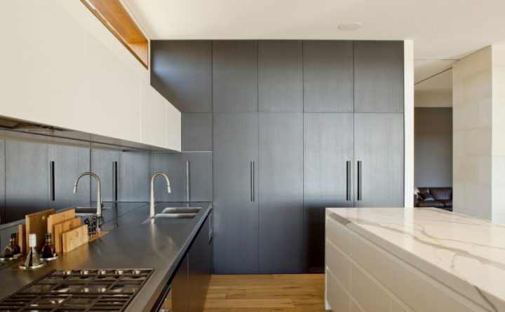
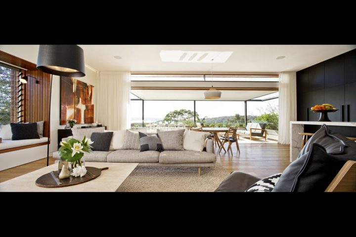
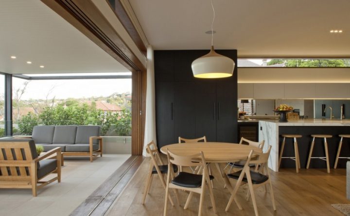
More often than not projects that catch my eye are Australian, our architectural style has  a definite affinity with that of Australian homes, it makes sense our climates and lifestyles are alike, its easy to see to see the similarities  – touches of timber, an emphasis on relaxed outdoor living.  This gorgeous home by Richard Cole Architecture could sit very comfortably on this side of the ditch!

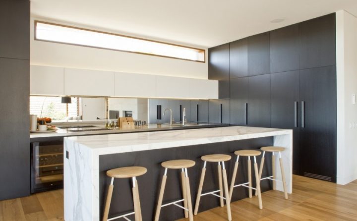
I love  the choice of products in the Middle Harbour House kitchen, Black and White is an absolutely timeless combination.

Simple black cabinetry, note the black handles, white ‘marble’ bench tops, mirror splash back, great attention to detail see’s the chopping board and oil bottles integrated into the bench top…brillaint

The simple  colour pallet of the kitchen extends into the living area seamlessly with the full height cabinetry creating a solid backdrop to the room. Again we see touches of timber, add natural fiber fabrics, full height drapes, subtle lighting and massive doors opening the entire width of the room. What more could you ask for?….nothing I think!
Courtyard Living

  • 30 January 2014

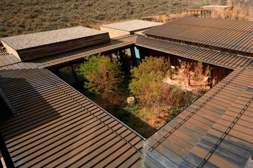
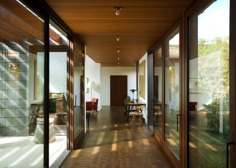
I have always been intrigued by the concept of internal courtyards in homes, as a student I visited a circular house with an internal courtyard, since then the concept has remained firmly at the top of my wish list. I love the self-contained privacy of them.

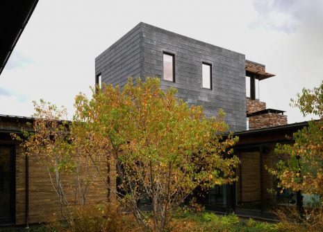
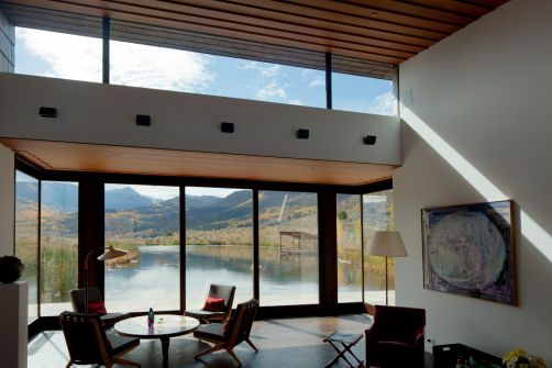
This home by Selldorf Architects is a great example; located in Colorado the images immediately reminded me of Queenstown.

The building is arranged around a central courtyard as a series of one-story pavilions dedicated to specific functions, spaces are linked by an internal corridor. Many of the external walls are floor to ceiling glazing making the most of the stunning views. While the internal courtyard is always protected from the prevailing wind and the neighbours!

(Photos: Todd Eberle)