Tag: Contemporary Design

Family bathroom design

  • 28 May 2021

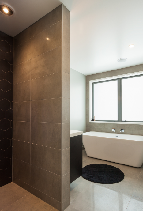
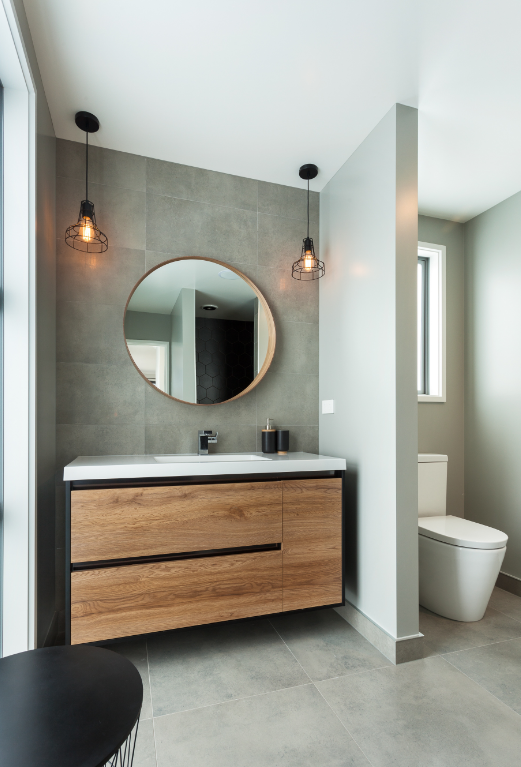
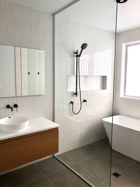
No surprises that a recent bathroom design brief for teenage sisters came with a hefty check list!  Maximum storage, natural lighting, good size bath and a spacious shower were hot on the list,  Mum’s final instruction was for a clean minimal aesthetic in keeping with the rest of the new build project.

In order to maximize space the bath was placed within the shower wet area, making the back to wall free standing bath a practical solution. A full height glass screen cleanly separated the room into two areas. Recessed mirror cabinet provided additional storage for smaller items and the wall hung vanity added to the illusion of space.  Matt white wall tiles in three different sizes and orientation added texture.


Beautifully constructed by Harwood Homes

 

Templeton Architecture

  • 7 November 2018

Take a browse through the project gallery of Melbourne based Templeton Architecture and you will see refined sophistication. Their bio describes an ethos of focusing on light, colour and proportion whilst respecting the Architectural history of each project.

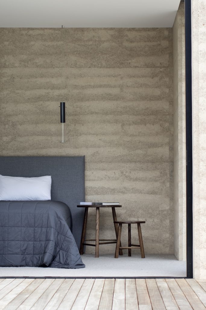
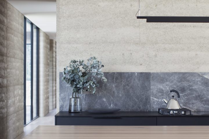
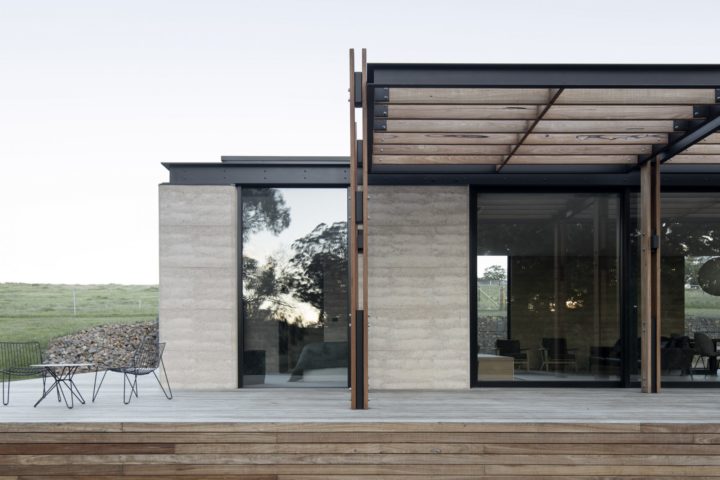
The Matilda project is a weekend getaway built on the clients childhood land Northeast of Victoria. The layered rawness of the Rammed Earth construction is breathtaking, it appears to hold history.  While the product was chosen for its thermal properties for me the solid timeless beauty of the earth surpasses any technical advantage!


Aptly described by Templeton Architecture as “The honest warmth of the material, and the depth of its construction, grounded the project into the natural contours of the land”

Templeton’s  homage to history can clearly been seen here in the Delatite Station  project as well

Beautifully elegant!


Ultimate Homes Mount Maunganui Show Home

  • 23 March 2018

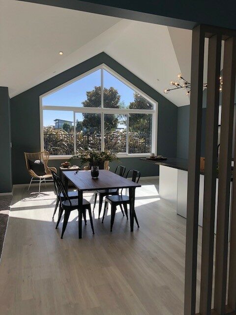
Working on show homes is a perfect opportunity to try something a little bit different.  The challenge to the Architect, JMAC  Architecture, the Designer – me  and the Builder Ultimate Homes is to stretch the imagination of the savvy show home punters by presenting something just outside the visitors comfort zone, something not see before but at the same time a home that is very livable.

Feedback to date on Ultimate Homes show home at The Coast Papamoa has ticked these boxes, it has become a memorable talking point in a sea of beige show homes.

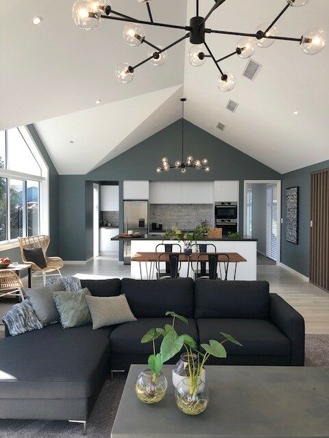
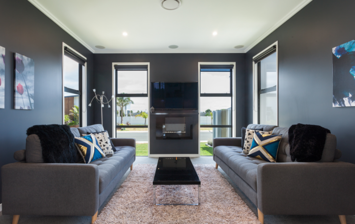
The cathedral ceilings of the living area are enhanced by  Dulux Rangatiki River a deliciously deep stormy blue green, daylight floods the open plan living space and the pure White ceilings compensate for the dark paint choice.

Mount Maunganui Show Home Interior Design Mount Maunganui Show Home Interior Design

Arent & Pyke

  • 8 November 2017

I’m a long time fan of  the work of Sydney Design Studio Arent & Pyke, I love their clean aesthetic, eye for detail and their use of colour.

Barcom Terrace project is a sympathetic modernization of an 1800’s boarding house all of the images are gorgeous but the 3 that catch my eye are below…

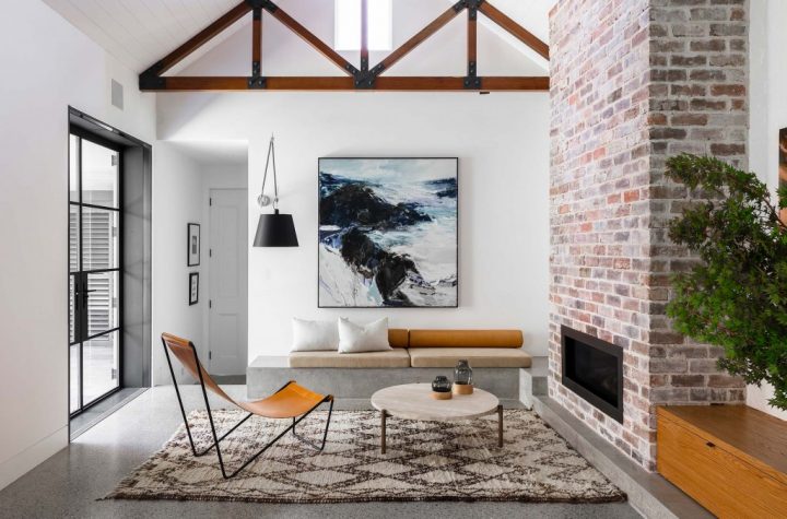
The unexpected use of concrete to create bench seating that then cleverly flows into the fire hearth grounds the room, the squab and cushion combination on the bench seat is again thoughtful. Default decision (as discussed on my previous blog) would be to have the squab full length with a multitude of cushions … I love the thoughtful detail of the short squab and the combination of cushion shapes the over-sized wall mounted lamp adds an intimacy to the space.

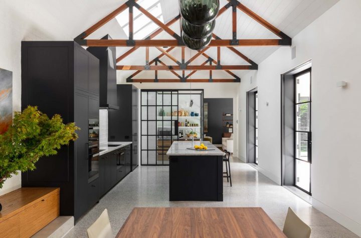
The kitchen sits majestically at the other end of this open-plan space, the steel framed joinery housing the Scullery not only visually separates the space but entices you into a space that is traditionally hidden

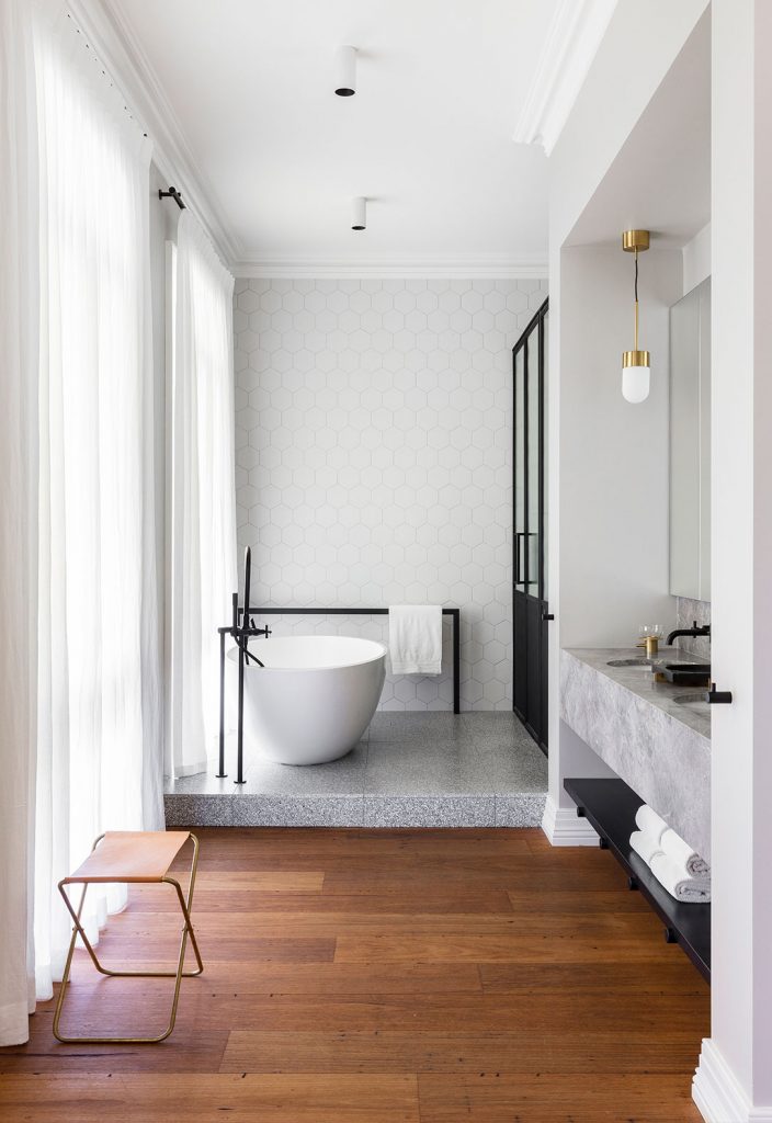
The industrial mix of the concrete plinth and black fittings with elegant wispy white fabric and marble  ……

Superbly Photographed by Tom Ferguson

Australian heritage house reinvented by tenfifyfive

  • 8 August 2017

Tenfifiyfive web site has me on the first page “Have nothing in your house that you do not know to be useful, or believe to be beautiful”  William Morris’s quote is one of my favorites and definitely  the basis of my own design ethos.

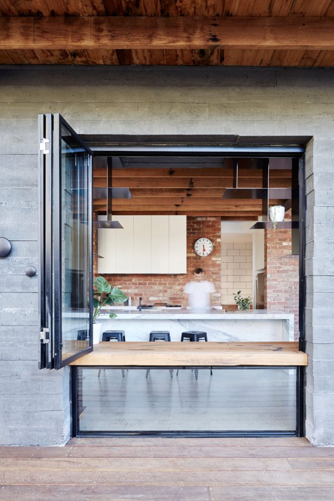
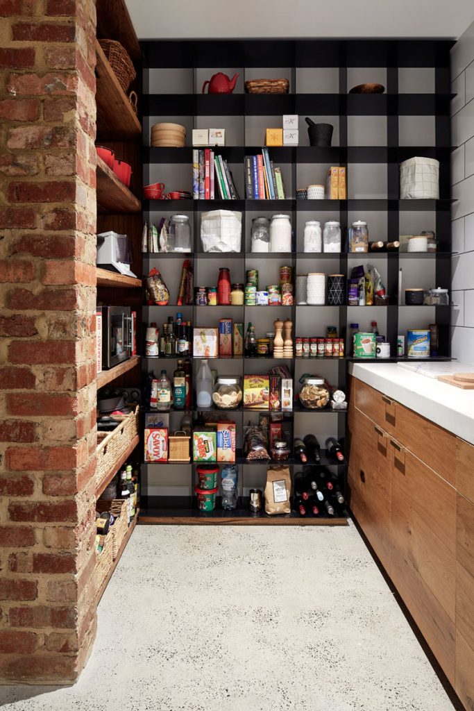
There is lots to admire in the studios gallery of work, I particularly like the combination of materials and attention to detail in the Park House project, rustic red bricks, warm timber, harsh raw concrete with super fine back steel and elegant Statuario marble all wrapped up in a family home.

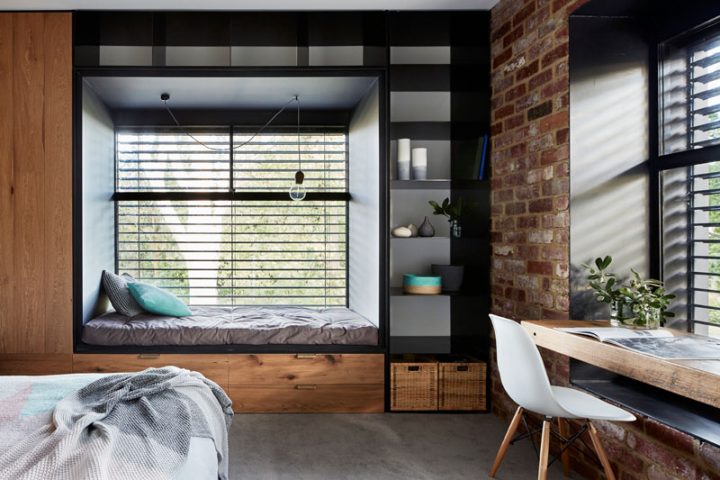
I’m a bit obsessed with window seats at the moment  I like to communal gathering space they offer, love the depth of this window seat and how the joinery wraps around the window, the depth detail is nicely repeated in the desk area.

As creatures of habit we make auto pilot decisions without considering alternatives, glass shower screens are always designed to disappear right?  Think again ….. glass framed in super fine black joinery is stunning. Auto pilot #2 cabinetry stops at the window .. not necessarily!

Layer upon layer of texture and detail … love it

Park House images by Christine Francis, first seen on Contemporist

Feature walls

  • 27 February 2017

I often get asked if people still do feature walls interestingly enough almost every time the question is voiced out loud it’s accompanied with a shame full cringe is if an unwritten rule has been broken and lighting is about to strike.

My reply is always this …….. There aren’t any Interior Design rules, lets face it it’s not a life and death situation! If there were rules and this was one of them and YOU love the idea of a feature wall then lets do it!

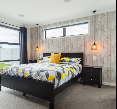
At least half of my projects have feature walls or feature rooms, it is a perfect way to add depth, mood, texture and personality.

This recently completed project in Mount Maunganui, is a great example of all of those things.

A harmonious collaboration between myself,  JMAC Architecture and  Ultimate Homes.

Images via Redfish

traditional plain interiors transformed into modern contemporary spaces

  • 22 March 2016

I recently completed a Perfect Combination Project – A blank canvas spec home + existing clients on their second project = boundaries pushed with amazing results!

The newly constructed spec home was beautifully proportioned but super plain – so plain it made you sleepy!! Client brief was to add some personality, warmth and interest so we set to work……..

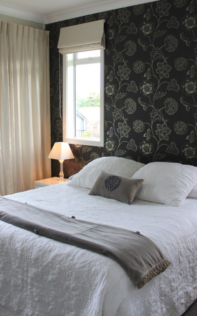
The Master bedroom was spacious  opening out onto a sunny courtyard but lacked any redeeming features so we added Harlequin wallpaper, Hemptech fabric and Bianca Lorenne Bed linen.

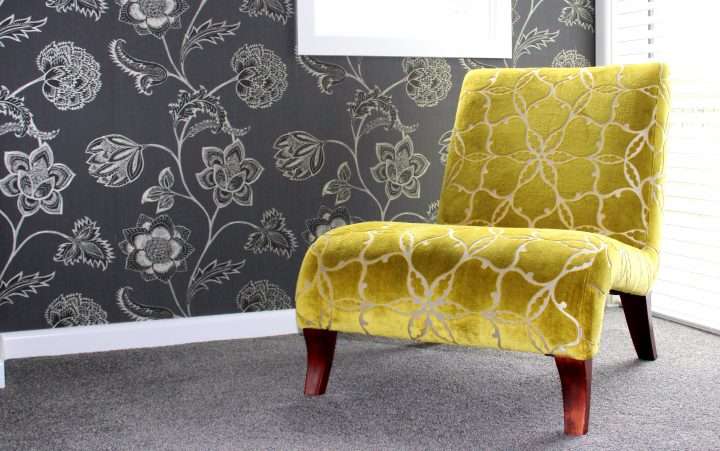
Feature wallpaper was repeated in the Lounge with dramatic effect, an existing David Shaw Chair was revitalized with new Harlequin fabric.

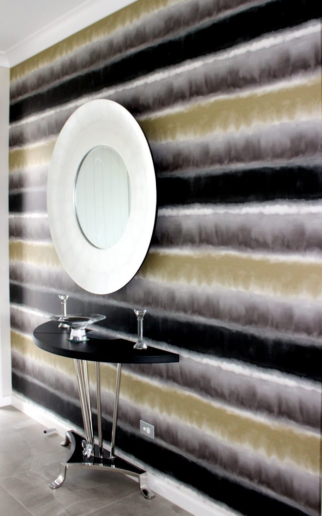
Another stunning Harlequin wallpaper in the entrance added drama

These simple additions change the house to a home.

A space well and truly stamped with the clients personality.